
In the world of design and visual communication, color palettes serve as the foundation for creating mood, message, and psychological resonance. Among the most compelling and enduring combinations is the blue and orange palette, a pairing that taps into both contrast and cohesion. This color scheme is found across a wide range of mediums including branding, digital interfaces, home décor, and film, capturing both attention and emotional balance.
TLDR: The blue and orange color palette is a highly effective combination due to the visual contrast and psychological harmony it offers. Blue evokes trust, calm, and dependability, while orange brings warmth, energy, and excitement. Used together, they create vibrant yet balanced designs that are frequently applied in marketing, user interfaces, and cinematic visuals. Understanding when and how to use these colors can significantly improve aesthetic coherence and user perception.
The Psychology Behind Blue and Orange
Color psychology plays a significant role in why the blue and orange palette is so versatile. Understanding these emotional connotations helps to explain their widespread use:
- Blue: Often associated with trust, stability, and calmness. It’s frequently used in business and tech branding for its sense of professionalism and reliability.
- Orange: Represents energy, enthusiasm, and warmth. Unlike aggressive reds, orange conveys friendliness and creativity without overwhelming intensity.
Together, these colors achieve a form of *balanced duality*. The coolness of blue tempers the intensity of orange, while orange enlivens the serenity of blue. This dynamic interplay creates a visually striking and emotionally stable combination.
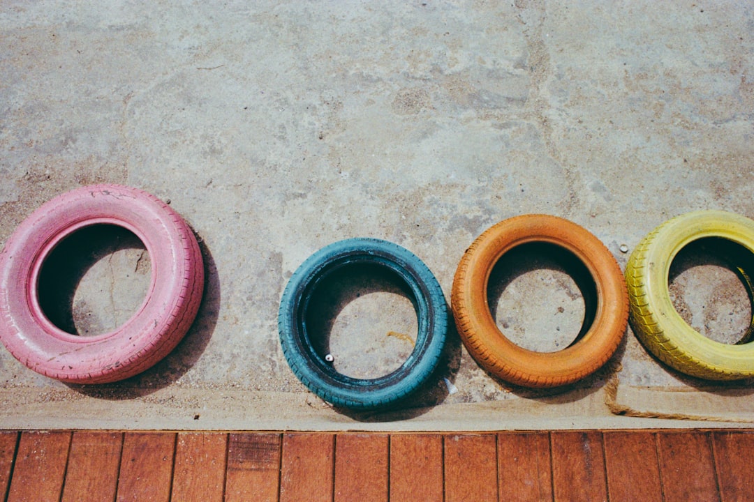
Color Theory and Complementary Contrast
On the color wheel, blue and orange are direct complements—meaning they sit opposite each other. Complementary color schemes are naturally high-contrast and provide a dynamic visual experience that still maintains harmony.
Designers often rely on this science when they want to highlight important elements without disrupting the overall aesthetic. Blue and orange, when used appropriately, command attention without conflict.
Applications Across Industries
1. Branding and Marketing
Businesses are keenly aware of the emotions that colors evoke. Brands like *Visa*, *PayPal*, and *LinkedIn* lean heavily into blue to foster a sense of trust. In contrast, brands like *Fanta*, *Nickelodeon*, and even *Amazon* use orange to stimulate enthusiasm and call to action.
Some companies even combine the two for maximal effect. For instance:
- Firefox: The logo features a vibrant orange fox wrapped around a blue globe.
- Gulf Oil: Combines a bright orange bubble with a sky blue background.
- JetBlue Vacations: Frequently employs blue typefaces with orange accents in advertising.
This blend allows businesses to radiate trust while encouraging engagement.
2. Web and UI Design
In digital design, usability and aesthetics must work in tandem. Blue and orange are often used to differentiate elements. For example, a navigation bar might be rendered in a cool blue while important call-to-action buttons—like “Sign Up” or “Buy Now”—are highlighted in warm, attention-grabbing orange.
Benefits of using blue and orange in UI design:
- Improved readability and visual hierarchy
- Effective call-to-action cues
- Appealing aesthetics with high accessibility

3. Interior Design and Architecture
Inside homes and buildings, blue and orange can articulate both calm and energy depending on ratio and intensity. Light, pastel blues can be used for walls or larger areas to create spaciousness, while bold oranges work well in accents like cushions, artwork, or rugs.
This palette is particularly effective in rooms designed for both relaxation and interaction, such as living rooms and creative workspaces. The ability to subtly energize a relaxed environment or calm a dynamic one makes the blue and orange combination highly adaptable.
4. Film and Photography
Cinema has long favored the blue and orange palette. Known as the “teal and orange” phenomenon, this approach exploits the human skin tone’s natural warmth, which stands out against cooler backdrops. It brings actors into focus while maintaining atmospheric depth.
Major motion pictures like *Transformers*, *Mad Max: Fury Road*, and *Inception* use this technique extensively, making scenes more emotionally charged and visually legible. The technique isn’t limited to big budgets; it is also prevalent in professional photography and social media filters.
Crafting a Balanced Blue-Orange Palette
Creating a successful palette involves more than just picking any blue and any orange. Variations in tone, saturation, and proportion can radically alter the mood and clarity of a design. Here are some key considerations:
- Choose your base: Will blue or orange dominate? More blue results in a calming presence; more orange creates higher energy.
- Balance saturation: Pair muted tones together or combine one bright with one soft to avoid color clashing.
- Use neutrals as buffers: Grays, whites, or even soft beiges can help separate blue and orange elements and make the composition easier on the eyes.
For example, a website might use a navy background (a muted blue), vibrant orange buttons, and white space in between to allow the calls to action to pop without overwhelming the user.
Accessibility and Colorblind Considerations
While aesthetically pleasing, designers must also account for accessibility. Blue and orange offer a better contrast ratio than many color pairings, making them a solid choice for visibility and legibility. However, always ensure sufficient contrast, especially in text, and test your designs against colorblind simulators.
Using texture differences, iconography, or additional testing tools will help ensure the palette maintains its effectiveness across all audiences.
Case Study: Sports Branding
Many sports teams use blue and orange to express both unity and competitive energy. Consider:
- New York Knicks (NBA): Bright orange and dark blue create a bold, aggressive energy perfectly matching the team’s identity.
- Denver Broncos (NFL): Their deep navy and burnt orange suggest both tradition and action.
- University of Florida Gators (NCAA): Blue for strength and orange for school spirit effectively engage fans.
These examples show how this palette communicates strength, optimism, and loyalty simultaneously.
Conclusion: Why Blue and Orange Endure
The blue and orange color palette has proven time and again to be a versatile and emotionally resonant choice. Its scientific grounding in color theory, combined with its psychological effectiveness, makes it a staple across various creative fields. Whether used in web design, branding, film, or interior décor, it enables users and viewers to experience both stimulation and trust—two of the most powerful emotional states you can evoke through color.
As trends cycle and tastes shift, the ability of the blue and orange palette to adapt, resonate, and communicate proposes its continued relevance long into the future. When thoughtfully applied, it doesn’t just *look good*—it feels right.

Products Businesses Explore Instead of Webhook.site for API and Webhook Testing
Modern software teams rely heavily on APIs and webhooks to connect services, automate workflows, and synchronize data across platforms. During…