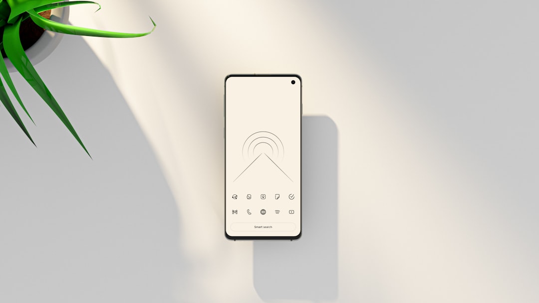
For clinics and service-based businesses, mobile traffic often represents the majority of website visits. Patients searching for urgent care, dental appointments, or specialist consultations frequently do so from their phones. In these decisive moments, the placement of a mobile call button can significantly influence whether a visitor becomes a booked appointment or leaves the site. Thoughtful positioning, clear design, and user-centered strategy can dramatically increase contact rates and overall conversions.
TLDR: The right mobile call button placement can significantly boost contact rates for clinics and service pages. It should be clearly visible, thumb-accessible, and persistently available without disrupting the user experience. Strategic positioning—such as sticky bottom bars or prominent hero section buttons—ensures visitors can act immediately when ready. Testing and optimizing placement based on real user behavior is essential for maximizing results.
Why Mobile Call Button Placement Matters
Mobile users tend to act quickly. When someone searches for a healthcare provider or service business, they are often motivated by urgency. The difference between a prominent, well-placed call button and one buried at the bottom of a page can directly impact contact rates.
Unlike desktop layouts, mobile screens have limited space. Poor placement can cause key action buttons to be hidden behind scrolling, dropdown menus, or cluttered layouts. Every additional second it takes a user to find contact information increases the likelihood of abandonment.
For clinics in particular, clear call functionality creates trust and accessibility. Patients want reassurance that help is just one tap away.
Understanding Mobile User Behavior
Before deciding where to place a call button, it is crucial to understand how users interact with mobile devices:
- Thumb zones matter: Most users navigate with one thumb.
- Scrolling is intuitive: Visitors expect to scroll but do not want to hunt for contact actions.
- Immediate access wins: Action buttons that are continuously visible often outperform static ones.
- Urgent intent drives decisions: Healthcare searches often reflect immediate needs.
Research consistently shows that elements positioned within easy thumb reach—typically near the bottom center of the screen—generate higher interaction rates.
Top Mobile Call Button Placement Strategies
1. Sticky Bottom Call Button
A sticky bottom call button remains fixed at the bottom of the screen as the user scrolls. This placement is highly effective because:
- It stays within the natural thumb zone.
- It is constantly visible.
- It removes the need to scroll back up.
For clinics and emergency-focused services, this method ensures patients can instantly call at any point during their browsing experience.
Best for: Urgent care clinics, dentists, veterinary services, repair services, and high-intent bookings.
2. Hero Section Primary Call Button
The hero section—the area visible before scrolling—should clearly present a primary action. On service pages, placing a visible “Call Now” button next to the main headline ensures immediate accessibility.
However, this button works best when combined with a persistent secondary option like a sticky footer button.
- Use contrasting colors.
- Ensure large tap targets (at least 44px height).
- Keep text clear and action-oriented.
Examples include:
- Call Now
- Speak to a Nurse
- Book by Phone
3. Floating Call Icon
A floating circular phone icon that hovers in a corner of the screen can also perform well. It is subtle yet accessible.
However, it must be:
- Large enough to tap easily.
- Positioned where it does not overlap essential content.
- High-contrast for visibility.
This approach often works best when designed minimally to avoid overwhelming the layout.
Placement Mistakes That Reduce Contact Rates
Even a well-designed website can suffer from low conversions due to poor button placement. Common mistakes include:
1. Hiding the Call Button in Menus
Requiring users to open a navigation menu to find a phone number adds friction. The primary call action should never be hidden.
2. Placing the Button Too High Only
If the call button appears only at the top of the page and disappears after scrolling, users must scroll back to access it.
3. Competing Calls to Action
Too many buttons—Chat, Email, Book Online, Subscribe—can cause decision fatigue. Clinics should prioritize calls when phone contact is the main goal.
4. Poor Thumb Accessibility
Buttons positioned in hard-to-reach top corners reduce interaction. Designing for natural thumb movement is critical.
Design Best Practices for Mobile Call Buttons
Placement alone is not enough. Design significantly impacts engagement.
Clear Contrast
The call button should stand out from the background. Use:
- High contrast colors
- Bold typography
- Clear visual boundaries
Action-Oriented Language
Generic labels like “Submit” do not perform well. Instead, use language that reflects urgency and assistance.
Effective examples:
- Call for Immediate Help
- Book Appointment Now
- Speak With Our Team
Click-to-Call Functionality
Ensure the button uses proper click-to-call linking so tapping immediately launches the phone dialer.
Large Tap Areas
Small buttons frustrate users. A minimum height of 44–48 pixels ensures comfortable interaction.
Aligning Placement With Page Intent
Different service pages may require slightly different strategies:
Emergency-Focused Pages
Use a bold sticky bottom bar with clear urgency messaging.
General Information Pages
Combine a hero button and subtle floating icon.
Specialist or High-Consideration Services
Place call buttons after trust-building sections such as:
- Testimonials
- Credentials
- Treatment explanations
This strategic positioning aligns with user psychology—they call once confidence is established.
Using Data to Optimize Placement
Assumptions should always be validated with testing. Clinics can improve contact rates through:
- A/B testing: Compare sticky bar vs floating icon.
- Heatmaps: Observe thumb interactions.
- Scroll tracking: Identify when users are most likely to contact.
- Conversion tracking: Measure calls generated from each layout variation.
Sometimes small adjustments—like increasing button size or changing color—can increase conversions by double-digit percentages.
Balancing Calls With Other Contact Methods
Some patients prefer forms or online booking. However, when the primary objective is increasing phone calls, the page should visually prioritize calling above secondary actions.
A clear hierarchy is essential:
- Primary: Call button
- Secondary: Online booking
- Tertiary: Email or contact form
This structure eliminates confusion and guides behavior without overwhelming visitors.
Accessibility and Compliance Considerations
Medical and service websites should ensure accessibility standards are met. This includes:
- Sufficient color contrast ratios
- Readable font sizes
- Screen reader compatibility
- Clear, descriptive button text
Accessibility not only improves inclusivity but also enhances usability for all users.
Conclusion
The placement of a mobile call button is not a minor design decision—it is a core conversion driver for clinics and service businesses. By keeping the button visible, thumb-accessible, visually distinct, and aligned with user intent, organizations can significantly increase contact rates.
Strategic placement combined with ongoing testing ensures that mobile visitors experience a frictionless path to action. Ultimately, the easier it is to call, the more likely patients are to reach out.
FAQ
1. Where is the best place to position a mobile call button?
The most effective position is typically a sticky bottom bar within the natural thumb zone. This ensures constant visibility and easy access as users scroll.
2. Should clinics use both a hero button and a sticky call bar?
Yes. A hero section button captures immediate intent, while a sticky bottom bar ensures accessibility throughout the browsing experience.
3. How big should a mobile call button be?
It should be at least 44–48 pixels tall to support comfortable tapping without errors.
4. Is a floating call icon better than a sticky bar?
It depends on the audience and urgency level. Sticky bars generally convert better for high-intent services, while floating icons can work for more information-based pages.
5. Can too many call buttons hurt conversions?
Yes. Overloading the interface with multiple calls to action can create confusion. Clear prioritization improves results.
6. How can clinics measure if their call button placement is effective?
By tracking click-to-call events, monitoring heatmaps, running A/B tests, and measuring total phone conversions before and after layout changes.
OCR Apps Like Microsoft Lens That Turn Images Into Editable Text
Optical Character Recognition (OCR) technology has transformed the way people interact with printed and handwritten documents. Instead of manually typing…