Faced with an abundance of options, today’s online shoppers crave clarity and speed. They want to know which product suits them best—without having to sift through a dozen tabs or read thousands of words of reviews. That’s where high-performing product comparison pages come in. These pages don’t just inform; they convert curious visitors into decisive buyers. But crafting a product comparison page that actually wins clicks—and sends a strong signal to search engines—requires more than just listing features.
Why Product Comparison Pages Matter
Whether you’re an e-commerce brand, affiliate marketer, or tech review site, comparison pages play a crucial role in the buyer’s journey. These pages often target users in the consideration stage of the purchasing funnel—people who already know what they want but aren’t sure which product is best.
When executed correctly, a comparison page can become a high-converting asset for both organic traffic and paid campaigns. Google tends to favor these pages when users search with modifiers like “vs,” “best,” or “compare,” and users love them for the sheer efficiency they provide.
What Makes a Comparison Page Click-Worthy?
A good product comparison page offers more than just a table of specifications. It merges design, psychology, storytelling, and SEO into a seamless user experience. Here are the top elements that make such pages stand out:
- Clarity Over Complexity: Avoid overwhelming users. Stick to easy-to-read layouts, visual cues, and concise descriptions.
- Actionable Insights: Instead of simply listing features, explain what they mean in real life.
- Visual Design: Clean, well-structured visuals guide users effortlessly through content.
- SEO Optimization: Use keywords strategically, and make navigation easy with internal linking and schema markup.
- Call-to-Action (CTA): Include well-placed CTAs to help users quickly make a decision or continue their journey.
Design Guidelines for Engagement
Design can make or break your product comparison page. A messy layout or information overload can push potential buyers away. A sleek, responsive design invites exploration.

Start with a headline that clearly communicates what you’re comparing and why. Use subheadings, bullet lists, icons, and charts to break up chunks of text. Your goal is an intuitive layout where users can instantly spot differentiating factors.
Incorporate elements like:
- Sticky headers for long scrollable tables
- Highlight boxes for top recommendations
- Responsive comparison tools for mobile users
Don’t forget contrast and whitespace—these are not design afterthoughts; they are essential to maintain focus and reduce friction.
Content That Tells a Story
Facts are useful, but stories create impact. Blend specifications with use-case scenarios. For example, instead of saying, “Model A has 6GB RAM and Model B has 8GB RAM,” explain that Model B is better suited for multitasking and heavy app usage.
This is where you connect emotionally. If you’re comparing fitness trackers, consider including personas—”Ideal for runners,” or “Perfect for casual tracking”—to help users visualize themselves using the product.
Consider using tools like FAQ sections or expandable accordions to offer deeper insights without cluttering the visual hierarchy.
Data Visualization—The Silent Persuader
Comparison tables are a staple—but how they’re rendered matters. Use visually engaging formats like:
- Color-coded columns
- Check marks and icons for feature availability
- Star ratings and user review summaries
Dynamic comparison tools that allow users to select features or filter criteria add a layer of interactivity, keeping them engaged longer—and more likely to click through.

SEO-First Yet User-Friendly
A product comparison page needs to be loved by both users and search engines. Start with keyword research. Find long-tail keywords that reflect true user intent, such as:
- Brand A vs Brand B wireless earbuds
- Best budget laptop for students 2024
- Compare DSLR vs Mirrorless for beginners
Use structured data to help search engines understand the context. Incorporate product schema, review schema, and breadcrumb markup. Not only does this enhance visibility on the SERPs, but it can lead to rich results, which catch the eye and boost click-through rates.
Avoid These Comparison Pitfalls
Even with all the right intentions, many comparison pages fall short because of these common mistakes:
- Overloading the user with too many product options or technical jargon
- Failing to prioritize—Not indicating which product is best in certain scenarios
- Ineffective calls-to-action—Users shouldn’t finish reading without knowing what to do next
- Ignoring mobile users—Failing to make tables swipe-friendly or displaying cramped layouts
Always test your page experience using tools like Google’s PageSpeed Insights and usability testing platforms to ensure your content resonates across devices.
Case Study: A Page That Gets It Right
Take, for example, a website comparing popular smartphones. The headline reads: “iPhone 14 vs Samsung Galaxy S22: Which One’s Right for You?”
Right beneath the headline, users encounter a clean visual chart that highlights key differences—camera quality, battery life, screen size, and price. Below that, detailed descriptions and user testimonials support the data with real-life usage scenarios.
There’s also a “Best For…” section showing:
- iPhone 14: Best for Apple ecosystem users
- Galaxy S22: Ideal for high-resolution videos and customizability
The page ends with a dual CTA: “Buy Now” and “Read Full Review,” giving users a choice depending on where they are in the funnel.
Split Testing and Continuous Optimization
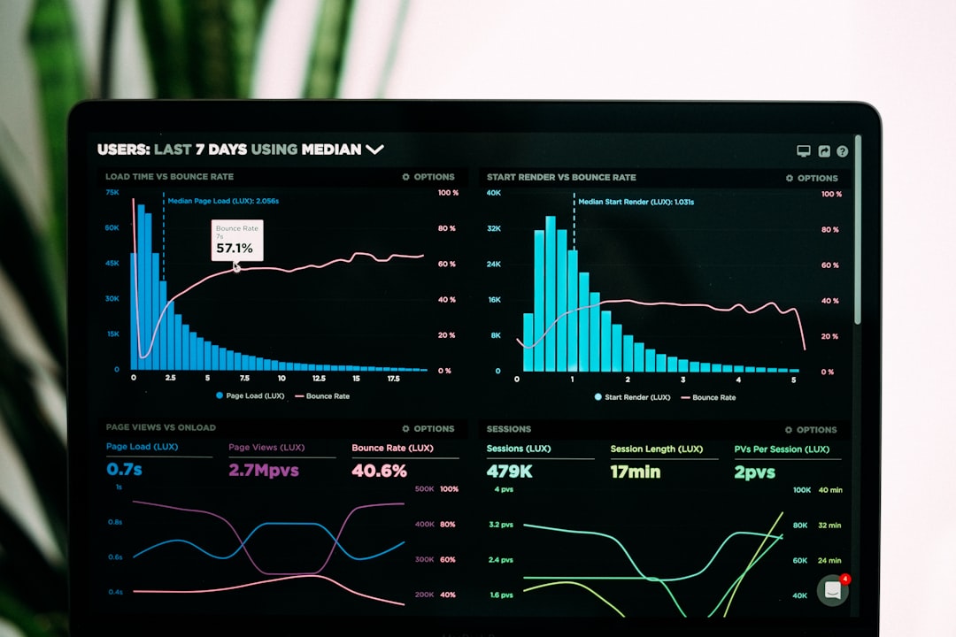
Like any digital asset, comparison pages require ongoing refinement. A/B test not just CTAs, but also layout variations, button colors, even content phrasing. Analytics tools like Hotjar and Google Analytics can reveal where users drop off or which sections generate the most engagement.
Key metrics to watch include:
- Bounce rate
- Average time on page
- Click-through rate from comparison table to product pages
- Conversion rate (if applicable)

The goal is constant improvement. A winning comparison page today could lose its edge in six months if newer features or competing pages surface. Stay vigilant.
Conclusion: Comparison Pages Are the New Conversion Engines
In an era where users are overwhelmed with choices, a well-executed product comparison page becomes a decision-making toolkit. When you combine clean, engaging design with rich content and SEO smarts, you don’t just earn clicks—you earn trust.
Whether you’re comparing tech gadgets, software tools, fitness gear, or financial services, the principles remain the same. Focus on providing value, clarity, and confidence. Do that, and your comparison page won’t just draw attention—it will drive conversions.
yehiweb
Related posts
New Articles
Firebase Cheaper Alternatives for Startups and Developers
Firebase has become one of the most popular Backend-as-a-Service (BaaS) platforms for startups and independent developers. Its real-time database, authentication,…


