
Apple Music has become one of the most widely used music streaming platforms in the world, boasting a sleek and modern user interface (UI) that reflects Apple’s renowned design philosophy. As the competition in the streaming market continues to intensify, the UI of Apple Music plays a crucial role in user retention, ease of navigation, and overall experience. This article delves deep into the elements that make up the Apple Music UI, how it has evolved, and what sets it apart from competitors.
TLDR
The Apple Music interface blends minimalist design with rich media content, offering users an intuitive and visually appealing experience. Whether navigating through albums, managing playlists, or discovering new music, the UI is designed to keep everything accessible and aesthetically pleasing. Its integration with the broader Apple ecosystem further enhances seamless usage. However, some complexity in settings and personalization tools may require a slight learning curve for new users.
UI Design Philosophy: Clean, Intuitive, and Iconic
The Apple Music UI embraces the core design principles that Apple is known for—simplicity, clarity, and consistency. The interface relies heavily on whitespace, legible typography, and consistent iconography to avoid visual clutter and confusion. Well-thought-out spacing and the use of hierarchy through color and font weight make it easy for users to identify content and navigate between sections.
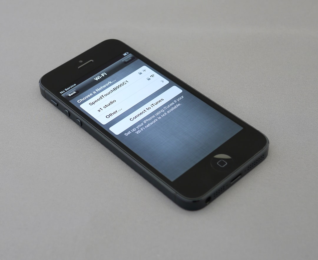
The software draws from Apple’s Human Interface Guidelines, combining functional design with aesthetics. Tabs at the bottom of the screen—Listen Now, Browse, Radio, Library, and Search—segment information effectively, limiting cognitive overload and helping users get to their desired destination quickly.
Key UI Elements That Define Apple Music
Several UI components within Apple Music are worth closer analysis due to their impact on usability and user satisfaction. Here are the most noteworthy:
- Navigation Bar: Positioned at the bottom, it’s the user’s compass. It allows toggling between core features with familiar icons and consistent placement across operating systems.
- Listen Now: The AI-curated section uses user listening behavior to suggest personalized playlists and albums. The stealthy blend of algorithm and aesthetics often makes it a go-to screen for discovering new content.
- Library: This section is focused on ownership and control, giving users access to downloaded music, playlists, albums, and artists. The clear categorizations and smart grouping based on recency or favorites are UI strengths here.
- Now Playing Screen: A full-screen, immersive view that displays the album artwork prominently, with straightforward controls and interactive options like lyrics and AirPlay integration easily accessible.
Animations and UI Transitions
Apple Music leverages subtle animations and micro-interactions to enhance the feeling of responsiveness and fluidity. When switching between tabs or tapping into an album, users are treated to seamless transitions that maintain context while navigating to deeper levels of the app’s structure.
This consistent motion design not only looks visually appealing but gives the user a subconscious sense of direction—where they came from and where they are going. Transition effects ensure that even during UI changes, the user never feels disoriented.
Dark Mode and Color Schemes
Apple Music’s UI supports Dark Mode seamlessly, adapting its color schemes in alignment with system-wide choices on iOS, iPadOS, and macOS. In both modes, the contrast, font spacing, and icon clarity are preserved carefully. Not only does this reduce eye strain for users, but it also upholds Apple’s accessibility standards.
White and grey tones dominate Light Mode while rich blacks and muted grays define Dark Mode; both are interspersed with colorful album art and accent hues for notifications and highlights. The attention given to color hierarchy ensures elements are readable without overwhelming the user visually.
Accessibility and Inclusive Design
Apple Music supports multiple accessibility features such as VoiceOver, Dynamic Type, and High Contrast UI. The interface is operable via gestures and commands that align with broader Apple device accessibility integrations. Font sizes can adjust for easier reading, and contrast settings ensure important icons and labels stand out when needed.
Additionally, Apple’s focus on universal icons and worldwide localization means the application is as usable in Tokyo as it is in Toronto, appealing to its global user base with high consistency across languages and cultures.
User Feedback and Iterative Improvements
Apple Music has undergone several UI adaptations since its inception. Initial versions faced criticism over being overly complex or too reliant on Apple ecosystem familiarity. However, each iteration since has simplified and clarified core navigation areas, added machine learning for better suggestions, and introduced new widgets and quick access tools on mobile lock screens.
Widgets and Siri Suggestions have improved discoverability and made daily music access more dynamic, while user-centric features—like Up Next queue customization and full-screen lyrics—have been bundled into context-aware designs.
Comparisons with Competing Platforms
When compared to Spotify or YouTube Music, Apple Music’s UI feels more aligned with luxury brand sensibilities. Its typography, album art prominence, and UI transitions create a strong visual experience. Unlike Spotify’s often gradient-heavy and darker UI aesthetic, Apple Music keeps things crisp and refined.
However, Spotify does edge out Apple Music in certain areas of social listening—where collaborative playlists and real-time sharing are better integrated. Apple continues to tweak its UI to address such limitations, recently introducing SharePlay for group listening and queue editing in group FaceTime sessions.
Integration with Apple Ecosystem
Perhaps one of the most significant UI strengths is Apple Music’s seamless integration into the larger Apple ecosystem. Whether it’s syncing music across Apple Watch, using Handoff between Mac and iPhone, or voice commands through Siri, the interfaces talk to each other smoothly.
- Widgets on iOS offer quick access with visual album previews.
- Notification shortcuts via AirPods help continue music with one tap.
- CarPlay and HomePod integration use a consistent UI language for users to feel familiar regardless of device.
Conclusion
The user interface for Apple Music is a compelling balance of form and function. While it sometimes leans heavily on the broader Apple ecosystem to feel complete, its clean design, intuitive navigation, and responsiveness make it a pleasure for everyday use. Over time, Apple has listened to its users and refined areas that once felt complicated, delivering a polished product that aligns with the brand’s aesthetic and usability expectations. For those seeking a beautiful, responsive, and well-integrated listening experience, Apple Music’s UI delivers on all fronts.
FAQs
- Q: Is Apple Music’s UI customizable?
A: While Apple Music does not support extensive customization, users can personalize playlists, rearrange their library, and adjust app themes via system-wide Dark Mode and font settings. - Q: Does Apple Music offer widget support?
A: Yes, Apple Music provides widgets for iOS and macOS that show recently played music, recommendations, and quick access options right on the home screen. - Q: Can I control Apple Music with Siri?
A: Absolutely. Apple Music is deeply integrated with Siri, allowing users to play songs, control playback, and even manage playlists via voice commands. - Q: How does Apple Music UI compare with Spotify?
A: Apple Music favors a cleaner and more minimalist UI design, while Spotify focuses more on social features and algorithmic discovery. Both have strengths depending on user preference. - Q: Is the UI the same across all Apple devices?
A: While the core design and layout principles remain consistent, the UI is responsively adjusted for different screen sizes and input methods across iPhone, iPad, Mac, and Apple Watch.

How Advertising Billing Software Simplifies Invoicing and Payments
Advertising moves fast. One day you are planning a campaign. The next day you are tracking clicks, approvals, budgets, and…