
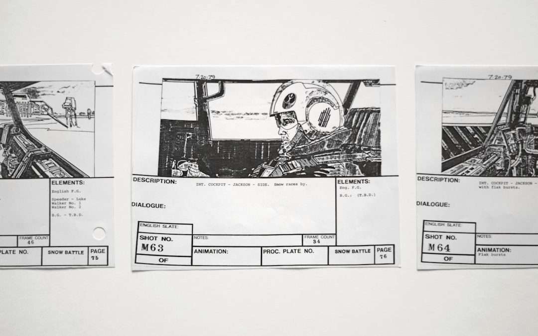

Use Uizard when you need a quick idea on screen today, and use Figma when the idea must become a polished product prototype tomorrow. Wireframes are your pencil sketch. High-fidelity designs are your shiny movie trailer. Both matter. Picking the wrong tool for the wrong stage can turn a simple product meeting into a tiny design soap opera.
TLDR: Uizard is great for fast wireframes, rough app screens, and AI-assisted concepts. Figma is better for high-fidelity design, design systems, team handoff, and serious prototyping. For example, a startup team could mock up 12 app screens in Uizard in one afternoon, then rebuild the winning 4 screens in Figma for investor testing. If your goal is speed, choose Uizard; if your goal is control, choose Figma.
Wireframe vs high-fidelity design, in human words
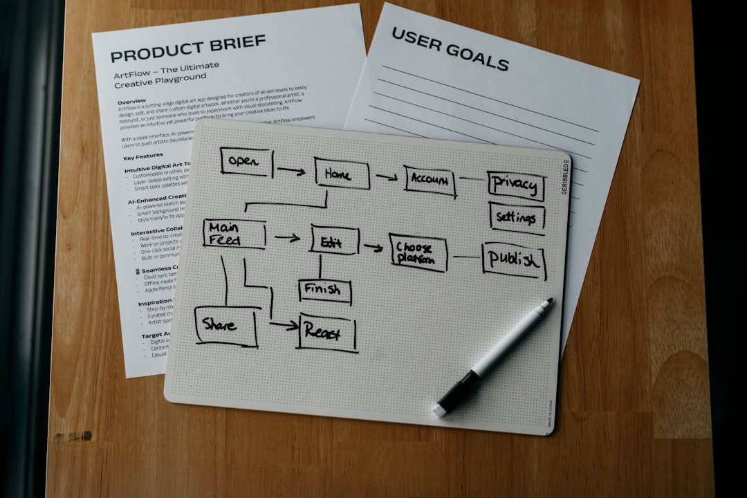
A wireframe is a rough plan. It shows where things go. Buttons. Images. Forms. Menus. Cards. It answers one question: Does this layout make sense?
A wireframe is not trying to look cute. It wears sweatpants. It says, “Here is the idea. Please do not judge my fonts.”
A high-fidelity design is the dressed-up version. It has real colors. Real buttons. Real spacing. Real images. It feels close to the final product. It answers another question: Will users believe this is real?
Think of it like building a café.
- Wireframe: “The counter goes here. Tables go there.”
- High-fidelity design: “The chairs are oak. The menu is cream. The lighting says fancy but not scary.”
Product teams need both. Starting with high-fidelity too soon can waste hours. Staying in wireframes too long can hide real design problems. Fun, right? No. But manageable.
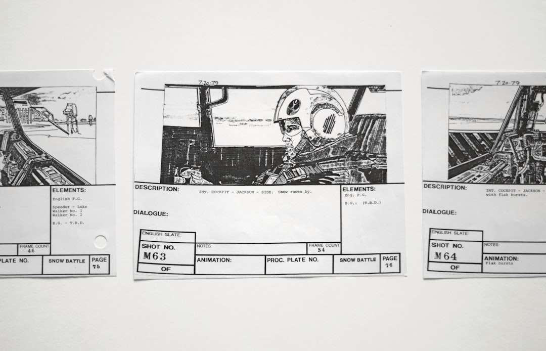
Where Uizard shines
Uizard is built for speed. It feels like a shortcut for early product thinking. You can turn sketches into screens. You can use AI prompts. You can make quick mockups without knowing every tiny design rule.
This is handy for founders, product managers, marketers, and non-designers. If you can describe an app screen, Uizard can help shape it. That is a big deal when your team has more ideas than hours.
Uizard is best for:
- Early wireframes
- Startup concepts
- Quick app mockups
- Pitch deck visuals
- Testing rough flows
- Turning hand drawings into digital screens
Here is a simple user case. A small fitness startup wants to test a meal planner app. They do not need perfect shadows or a 64-color style guide. They need five screens by lunch. Login. Dashboard. Meal plan. Grocery list. Checkout. Uizard can get them there quickly.
The nice part is that Uizard reduces blank-page panic. That first empty canvas can feel rude. Uizard gives you a starting point. You can then edit, move, delete, and fix the weird bits.
But yes, there are weird bits. AI-generated layouts can feel a little “almost right, but why is that button floating there?” Expect some cleanup. Honestly, it feels like hiring a very fast intern who drinks too much coffee.
Where Figma wins
Figma is the serious design workshop. It is powerful. It is flexible. It is loved by product teams for a reason. You can create beautiful high-fidelity designs, clickable prototypes, reusable components, and full design systems.
Figma is best for:
- High-fidelity product screens
- Interactive prototypes
- Design systems
- Developer handoff
- Team comments and reviews
- Responsive product design
If Uizard is a quick sketchpad with AI magic, Figma is a full design studio. It gives you control over spacing, color, states, grids, variants, and interactions. That control matters when your product is moving toward launch.
Say your team is building a banking app. Tiny design choices matter. A disabled button must look disabled. Error messages must be clear. Input fields need states. Hover. Focus. Active. Loading. That is where Figma feels much safer.
It drives me crazy that a small layout change in a messy Figma file can take 30 seconds longer than it should because one frame is nested inside three mystery groups. Still, this is often a file hygiene problem, not a Figma problem. Name your layers. Future you deserves kindness.

Wireframes: when ugly is useful
Wireframes are meant to be plain. That is the point. When screens are simple, people focus on structure. They ask better questions.
- Can users find the main action?
- Is the signup flow too long?
- Does the dashboard show the right data first?
- Are there too many choices?
If a wireframe is too pretty, feedback gets silly. Someone will say, “Can the blue be softer?” Great. But the checkout flow has six steps and people are leaving. The blue can wait.
Use Uizard here if your team needs momentum. It is especially useful in workshops. You can sketch ideas, generate screens, and compare options without turning the session into a design lecture.
High-fidelity: when pretty becomes practical
High-fidelity design is not just decoration. It helps teams test trust, emotion, and clarity. Users react differently to real-looking screens. They click with more confidence. They notice missing details.
A rough wireframe may show a payment page. A high-fidelity mockup can show whether that payment page feels safe. That matters. A user may understand the layout but still think, “Nope, I am not putting my card there.”
Use Figma here. It lets you create polished flows that feel close to production. You can link screens. Add transitions. Build components. Share prototypes. Collect comments. Hand off specs to developers.
For example, a SaaS team might run a usability test with 20 users. In a wireframe test, maybe 65% complete the task. After a high-fidelity Figma prototype with clearer buttons and better spacing, completion may rise to 82%. That is not magic. That is clarity.
Figma vs Uizard: simple scorecard
| Need | Better choice | Why |
|---|---|---|
| Fast idea mockup | Uizard | AI tools help you start quickly. |
| Hand-drawn sketch to screen | Uizard | It can convert rough sketches into layouts. |
| Polished app prototype | Figma | You get better visual control. |
| Design system | Figma | Components and variants are stronger. |
| Developer handoff | Figma | Specs, assets, and comments are easier to manage. |
| Non-designer workflow | Uizard | It feels less intimidating. |
Best workflow: use both
The smartest choice is often not Figma or Uizard. It is Uizard first, Figma second.
- Start in Uizard. Make rough screens fast.
- Test the flow. Check if the idea makes sense.
- Pick the strongest version. Do not polish every idea.
- Move to Figma. Rebuild with real visual rules.
- Create a clickable prototype. Test it with users.
- Prepare handoff. Give developers clean specs.
This workflow keeps speed at the start and quality at the end. It also saves people from arguing about button colors before the product flow even works. A true gift.
Which one should you pick?
Pick Uizard if you are still asking, “What should this product be?” It is quick, friendly, and useful for rough concepts. It helps you move from idea to screen without a long setup.
Pick Figma if you are asking, “How should this product really look and work?” It is the better tool for polish, systems, and team production.
If you are a founder, start with Uizard. If you are a product designer, live in Figma. If you are a product manager, use both and make everyone slightly less confused.
Final rule: wireframe to think. High-fidelity to prove. Uizard helps you think faster. Figma helps you prove better.
Wireframe vs High-Fidelity Design: Figma vs Uizard for Product Prototyping

Wireframe vs High-Fidelity Design: Figma vs Uizard for Product Prototyping
Use Uizard when you need a quick idea on screen today, and use Figma when the idea must become a…