In the early 2000s, a revolutionary gadget changed how we experience music on the go—the iPod. Among its most iconic features was not its storage capacity or its design alone, but its navigational interface: the iPod wheel. Also known as the “Click Wheel,” this defining characteristic embodied Apple’s philosophy of blending simplicity with functionality. Even years after the iPod’s prime, the wheel remains a fascinating example of elegant user interface design.
TL;DR
The iPod Click Wheel was a revolutionary navigational tool that allowed users to browse music and settings using a physical, touch-sensitive dial. Its simple and intuitive design made the iPod incredibly easy to use. The wheel blended tactile feedback with capacitive touch to deliver accurate, responsive control. While it has largely disappeared with the decline of dedicated music players, it’s still celebrated as a milestone in interface innovation.
Origins of the iPod Wheel
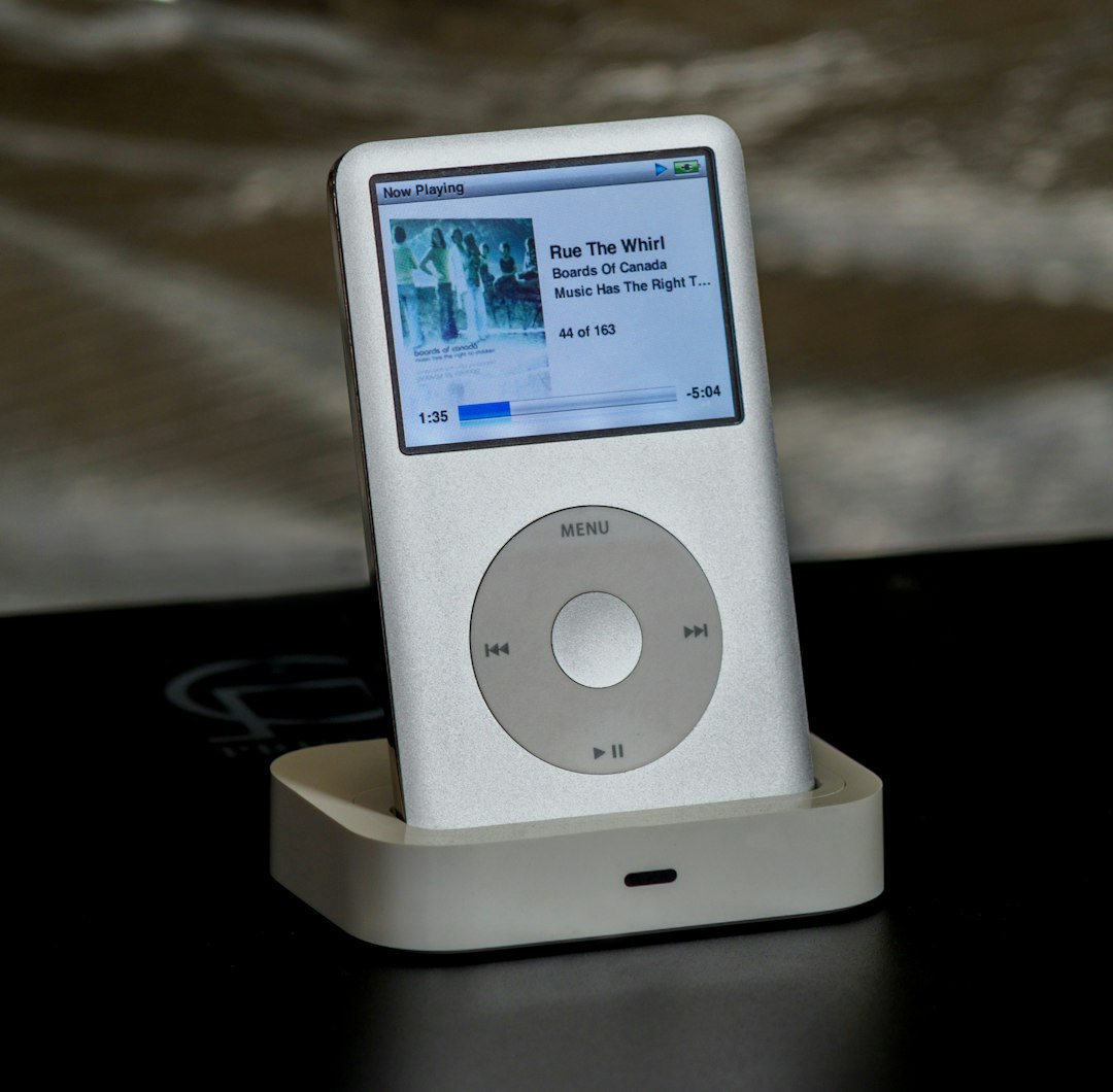
When the original iPod debuted in 2001, it featured a mechanical scroll wheel with four surrounding physical buttons. As the product line evolved, so too did this navigation tool. By 2004, Apple had introduced the full-fledged Click Wheel, most notably featured in the iPod Mini and later in the iPod Classic models.
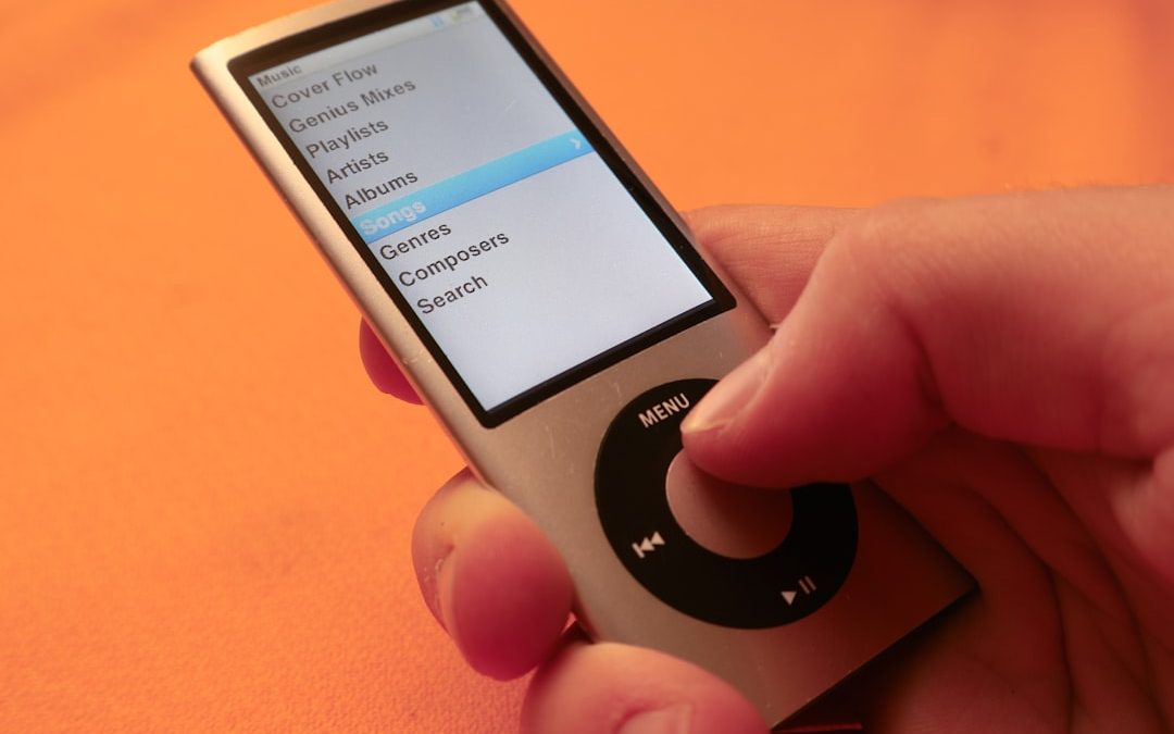
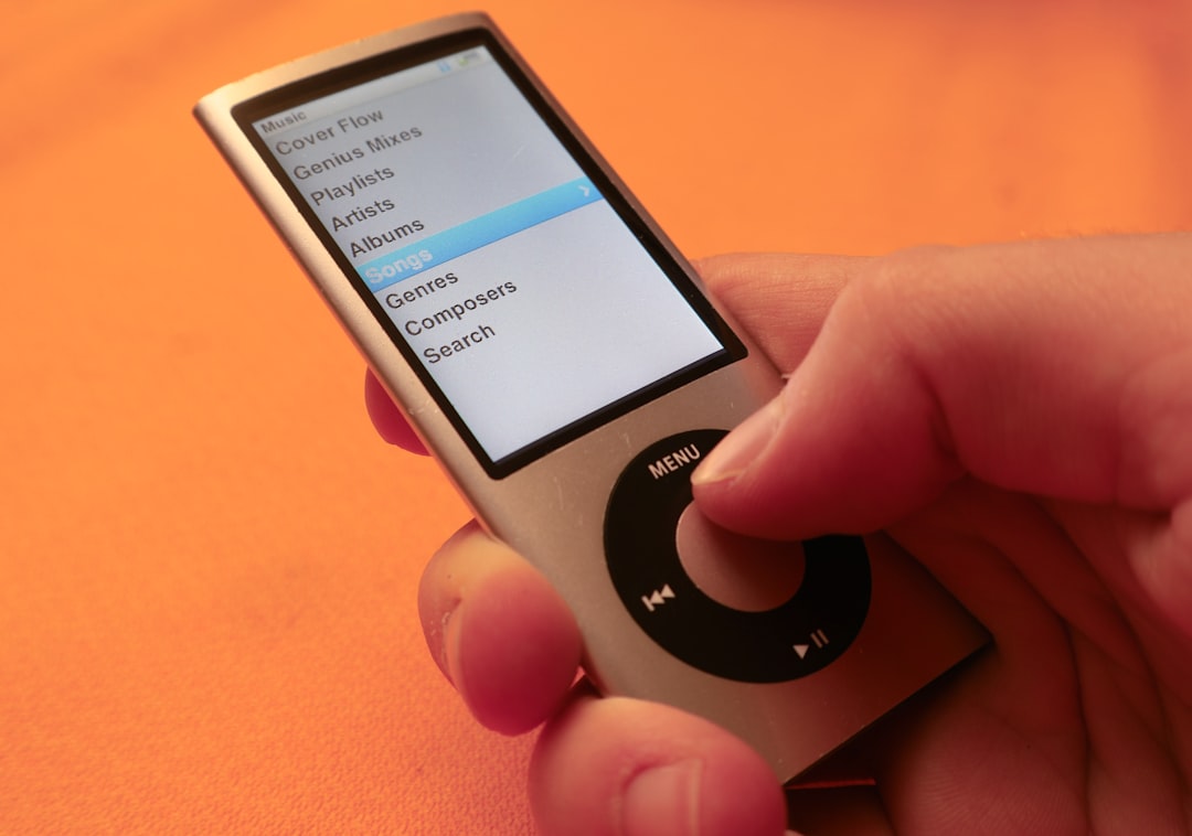
This innovative input mechanism allowed users to navigate large libraries of songs, artists, playlists, and settings with just their thumb. With no need for a stylus, touch screen, or keyboard, the iPod wheel redefined the expectations and requirements for consumer electronics interactions.
Mechanics Behind the Click Wheel
The brilliance of the iPod Click Wheel lies in its hybrid nature. It combined:
- Capacitive Touch Technology: The wheel detects where and how fast your finger moves around the ring. This technology works by sensing the electrical properties of skin, enabling touch sensitivity without pressure.
- Physical Buttons: Embedded beneath the wheel are mechanical buttons at the four cardinal points—Menu, Play/Pause, Forward, and Back. These provided tactile feedback, enhancing the overall user experience.
This synergy between touch sensitivity and physical interaction made the device feel both modern and reliable. You didn’t just scroll—you felt every interaction, which gave users a sense of control and precision that many miss in today’s touch-only interfaces.
Usability and User Experience
One of the most lauded aspects of the iPod wheel was its intuitive nature. Users could:
- Scroll through thousands of songs quickly by gliding their thumb in a circular motion.
- Navigate menus logically—rotating clockwise scrolled down, counterclockwise scrolled up.
- Use physical feedback to confirm selections and play commands.
This design allowed for one-handed operation. You didn’t need to look at the device to adjust volume or skip tracks—perfect for walking, commuting, or exercising. It’s the kind of muscle memory modern users often associate with older analog systems, like rotary phones or manual film cameras.
Moreover, the design encouraged habitual use. The wheel’s responsiveness trained the user to associate subtle hand gestures with specific digital actions. There was no lag or confusion—it just worked.
Challenges and Limitations
As seamless as it may have felt, the Click Wheel had its own set of limitations:
- Durability: While it lasted a surprisingly long time for many users, over time, the capacitive sensors or buttons could malfunction due to wear and tear or moisture ingress.
- Gesture Limitations: It wasn’t ideal for typing or complex menu interactions, which made it less suitable for devices beyond music players.
- Learning Curve: Although many users found it intuitive, some first-time users required a few tries to understand the circular, gesture-based navigation.
These issues eventually contributed to the deisgn being phased out as touchscreens became more cost-effective and versatile. However, these limitations never impacted the iPod wheel’s cultural cachet or usability in its prime environments.
Design Elegance: Form Meets Function
The visual and tactile appeal of the iPod wheel was no accident. Apple’s product designers, including the legendary Jonathan Ive, treated the device as a cohesive whole where every physical feature had a purpose.
The wheel’s placement in the dead center of the device was both symmetrical and functional. It served as a striking focal point and a practical interface. Its matte surface provided grip, and its subtle rotary feedback mimicked analog dials, appealing to the human sense of familiarity.

Furthermore, having in-line buttons underneath the wheel allowed Apple to avoid clutter. This provided a seamless and clean front face—part of the iPod’s sleek minimalist aesthetic. Every movement, every input felt intentional, contributing to the emotional experience of using the product.
Impact on Interface Design
The influence of the iPod Click Wheel extended well beyond Apple’s own line of products. It became a standard-bearer for minimalist interaction design, eventually shaping the expectations of how digital menus should flow. The wheel was arguably one of the earliest successful attempts to simulate analog control within a digital framework.
Here are some of the interface lessons that continue to influence modern UX/UI designs:
- Physical Feedback Matters: Many users appreciate the feedback that comes from physical buttons or haptics rather than flat touchscreens alone.
- Simplicity Is Key: You don’t always need more buttons or bigger screens—sometimes tighter, more natural controls create a richer experience.
- Navigation as an Experience: How a user moves through menus can be just as important as what they see.
These principles later found their way into Apple’s other products—like the digital crown on the Apple Watch, which in many ways is a spiritual successor to the Click Wheel.
The End of the Wheel, But Not the Legacy
Eventually, as touchscreen devices like the iPhone and iPod Touch took over, Apple phased out the Click Wheel. These new interfaces offered greater flexibility, multimedia capabilities, and app support that the wheel couldn’t provide.
Yet, nostalgia for the iPod wheel remains strong. In fact, hobbyist communities and retro-tech enthusiasts often restore old iPods—or even convert them with modern solid-state storage—all to recapture that tactile magic. The wheel isn’t just a scrollpad—it’s a design legacy from a time when absolute simplicity was not only the goal but also the experience.

Conclusion
The iPod wheel represents an important chapter in the history of digital device interaction. It provided an interface that was intuitive, elegant, and unique—a rare feat in modern tech. Though now largely obsolete, its principles live on in products focused on efficiency, minimalism, and emotional resonance in user interactions.
Its story reminds us that great design isn’t just about what looks good—it’s about what works so well, you barely even notice it. And for millions of users, the rhythmic spin of the iPod wheel was nothing short of magic.

Understanding QLCredit: A Beginner’s Guide to Online Loans
Online loans are everywhere today. You see them on social media. You hear about them from friends. One name that…