
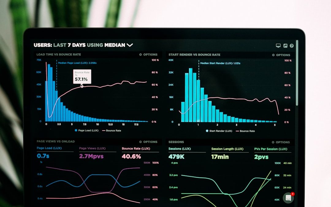

A management dashboard is a visual reporting tool that helps leaders, managers, and teams monitor business performance in one place. Instead of searching through spreadsheets, reports, and disconnected systems, decision-makers can use a dashboard to see the most important information quickly and take action with greater confidence.
TLDR: A management dashboard presents key business metrics in a clear, visual format so managers can track performance, identify issues, and make faster decisions. It often includes charts, tables, scorecards, and alerts connected to live or regularly updated data. The best dashboards focus on the metrics that matter most, avoid clutter, and are designed around the needs of the people using them.
What Is a Management Dashboard?
A management dashboard is a centralized view of an organization’s most important data. It is typically used by executives, department heads, project managers, and team leaders to understand how the business is performing against goals. A dashboard may show financial results, sales activity, marketing performance, operational efficiency, customer satisfaction, employee productivity, or project progress.
Unlike a traditional report, which may be long and detailed, a dashboard is designed for quick interpretation. It uses visual elements such as line charts, bar graphs, gauges, heat maps, and KPI cards to make complex information easier to understand. A well-built dashboard answers three basic questions: What is happening? Why does it matter? and What should happen next?
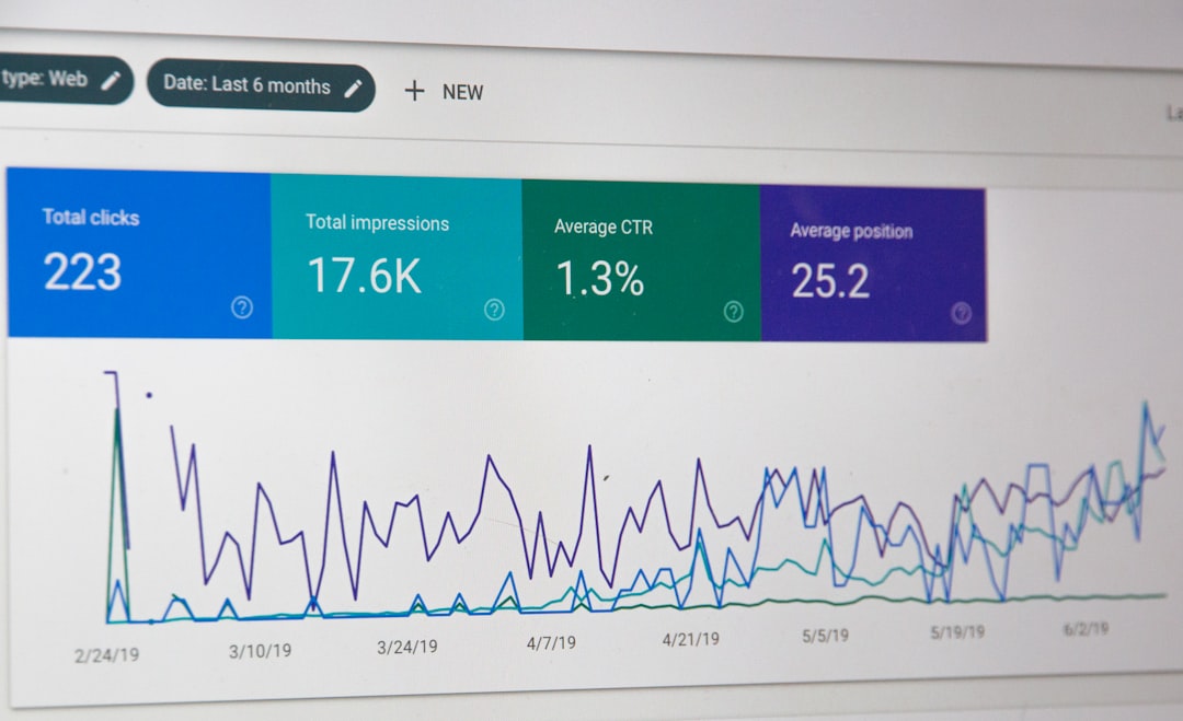
Why Management Dashboards Matter
Modern organizations generate large amounts of data every day. Without a structured way to review that data, managers may miss warning signs, duplicate work, or make decisions based on incomplete information. A management dashboard reduces this risk by turning raw data into an organized performance view.
Dashboards also improve accountability. When teams can see their goals, progress, and results clearly, it becomes easier to understand what is working and where adjustments are needed. For example, a sales manager may use a dashboard to compare monthly revenue against targets, while an operations manager may track delivery times, production volume, or service quality.
Another major benefit is speed. Instead of waiting for weekly or monthly reports, managers can monitor performance more frequently. In many cases, dashboards update automatically, giving leadership a near real-time view of business conditions.
Key Metrics to Include in a Management Dashboard
The right metrics depend on the organization, industry, and dashboard audience. However, several categories are commonly included in management dashboards.
1. Financial Metrics
- Revenue: Total income generated during a specific time period.
- Profit margin: The percentage of revenue left after costs are deducted.
- Operating expenses: Ongoing costs such as salaries, rent, software, and utilities.
- Cash flow: Money moving in and out of the business.
2. Sales Metrics
- Sales pipeline value: The estimated value of potential deals.
- Conversion rate: The percentage of leads that become customers.
- Average deal size: The typical value of a closed sale.
- Sales target progress: Performance compared with monthly or quarterly goals.
3. Marketing Metrics
- Website traffic: The number of visitors to a company’s website.
- Lead generation: The number of qualified prospects created through campaigns.
- Cost per lead: The average cost to acquire a new lead.
- Campaign return on investment: Revenue or value generated from marketing spend.
4. Operations Metrics
- Productivity rate: How efficiently resources are being used.
- Order fulfillment time: How long it takes to complete and deliver orders.
- Error rate: The percentage of mistakes, defects, or failed processes.
- Capacity utilization: How much of available production or service capacity is being used.
5. Customer Metrics
- Customer satisfaction score: A measure of how happy customers are with products or services.
- Net promoter score: The likelihood that customers will recommend the business.
- Customer retention rate: The percentage of customers who continue buying over time.
- Support response time: How quickly customer service teams respond to requests.
Examples of Management Dashboards
Management dashboards can be designed for different departments and decision-making levels. The best example depends on who is using the dashboard and what decisions they need to make.
Executive dashboard: This dashboard gives senior leadership a high-level summary of company performance. It may include revenue, profit, growth rate, customer retention, market share, and strategic goal progress. It is usually concise and focused on long-term business health.
Sales management dashboard: A sales dashboard tracks pipeline activity, closed deals, quota attainment, lead sources, and team performance. It helps sales leaders identify strong performers, stalled opportunities, and revenue risks.
Project management dashboard: This dashboard shows project timelines, completed tasks, budget usage, deadlines, risks, and resource allocation. It allows managers to see whether projects are on schedule and within budget.

Marketing dashboard: A marketing dashboard focuses on campaign performance, traffic sources, conversion rates, advertising costs, email engagement, and lead quality. It helps marketing teams decide where to invest more resources.
Operations dashboard: This dashboard monitors efficiency, production output, inventory levels, service requests, quality control, and bottlenecks. It is especially useful in manufacturing, logistics, retail, and service environments.
Dashboard Design Tips
A dashboard is only useful if people can understand and act on it. Good design is not just about appearance; it is about making information clear, relevant, and easy to use.
- Start with the audience: A CEO, sales manager, and operations supervisor will not need the same information. The dashboard should match the user’s responsibilities.
- Prioritize key metrics: Too many numbers can create confusion. The dashboard should focus on the most important KPIs that support business decisions.
- Use clear visual hierarchy: The most important metrics should appear near the top or in the most visible area. Supporting details can be placed lower on the page.
- Choose the right chart type: Line charts are useful for trends, bar charts work well for comparisons, and scorecards are effective for single KPI values.
- Keep the design simple: Excessive colors, icons, and decorative elements can distract from the data. A clean layout usually works best.
- Add context: A number alone may not be meaningful. Targets, previous period comparisons, and percentage changes help users understand performance.
- Make it actionable: The dashboard should help managers decide what to do next, not simply display information.

Common Dashboard Mistakes to Avoid
One common mistake is including every available metric. This often results in a crowded dashboard that is difficult to interpret. Another mistake is using visuals that look impressive but do not communicate clearly. For example, a complex 3D chart may be less useful than a simple bar chart.
Managers should also avoid relying on outdated or inaccurate data. If users do not trust the dashboard, they may stop using it. Data sources should be reviewed regularly, and definitions should be consistent across the organization. For instance, if one department defines a “qualified lead” differently from another, dashboard results may create confusion.
Conclusion
A management dashboard is a powerful tool for turning business data into useful insight. When designed well, it helps managers track performance, spot problems early, and guide teams toward better results. The most effective dashboards are focused, visual, accurate, and aligned with real business goals. Rather than showing data for its own sake, a strong dashboard supports smarter and faster decision-making.
FAQ
What is the main purpose of a management dashboard?
The main purpose is to give managers a clear, visual overview of important business metrics so they can monitor performance and make informed decisions.
What should a management dashboard include?
It should include relevant KPIs, charts, comparisons, targets, trends, and alerts. The exact content depends on the user’s role and business objectives.
How often should a dashboard be updated?
Update frequency depends on the use case. Some dashboards update in real time, while others may be refreshed daily, weekly, or monthly.
What makes a dashboard effective?
An effective dashboard is easy to read, focused on important metrics, visually clear, accurate, and designed to support action.
Who uses management dashboards?
Executives, department managers, team leaders, project managers, and analysts commonly use management dashboards to track goals and performance.


WP Clone: Duplicator vs WPvivid for Cloning WordPress Websites
Pick Duplicator for a clean one-off move, and pick WPvivid if you want regular cloning, backups, and staging. That is…