Smartphones have become such an integral part of our lives that it is reasonable to say we are glued to them at times. They are easily transportable, do not require a surface to be placed on, and do not take up a lot of room.
Having said that, creating websites for phones does require some additional effort. Nowadays, it is truly essential to have a mobile version of your website since the pandemic managed to change areas ranging from banking to online shopping.
In this post, we will discuss the advantages of having a mobile version and highlight the 6 best WordPress plugins that can assist you in making your website mobile-friendly. There is also a web development company that can do this for you!
Jetpack

Jetpack is a mobile-friendly WordPress plugin that is both free to install and simple to use. It is a sophisticated tool that allows you to optimize your website.
SEO tools, social networking site integration, WordPress mobile app integration, mobile-optimized themes, secure login, tiled galleries, carousel, plugin support, site statistics, analytics, and many more features come with this one simple plugin.
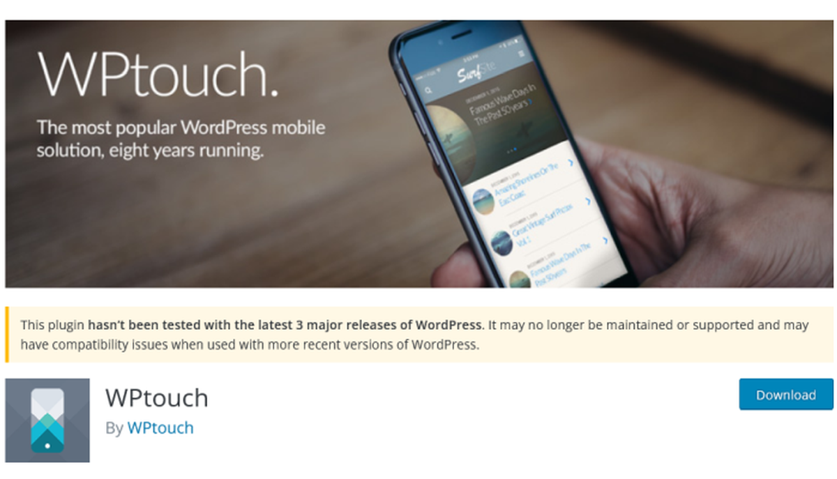
WPtouch

WPtouch is a popular WordPress plugin that lets you create mobile versions of your website. This plugin offers a wide variety of great choices of themes from their library. The plugin supports 23 languages and has features such as the WPtouch admin panel, Customizer, upgraded mobile-friendly interface, outstanding customer service, user-friendly interface, and so much more.
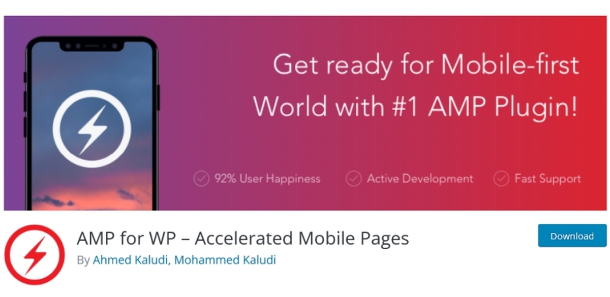
AMP for WordPress

AMP for WordPress allows you to build mobile-friendly versions of your web pages that are quick, fluid, and simple to navigate. It also removes the majority of the components that might cause your website to load slowly (JavaScript, third-party scripts, etc.). However, it isn’t a jack of all trades plugin and you’ll almost certainly need to add extra plugins if you want your website to run smoothly.
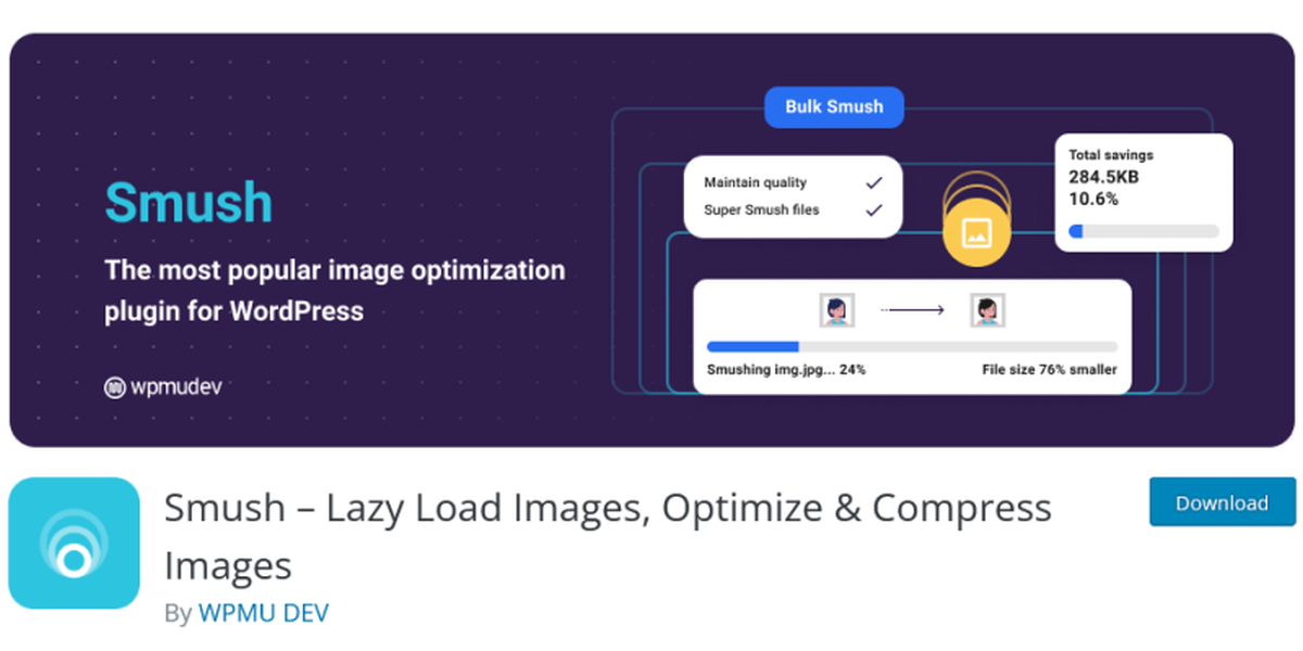
Smush

Smush is a WordPress image compression and optimization plugin that has won several awards. When you submit photos, they are automatically reduced to a size that has no discernible effect on page performance while remaining mobile-friendly. Even if your website has been up and running for a while, Smush will compress up to 50 pictures at a time.
Autoptimize

Autoptimize allows you to select a specific mobile device and check how your website looks on that device after inputting your website’s URL. This is a fantastic method for evaluating how your site looks on mobile devices and to test popular features like share buttons and sign-up forms.
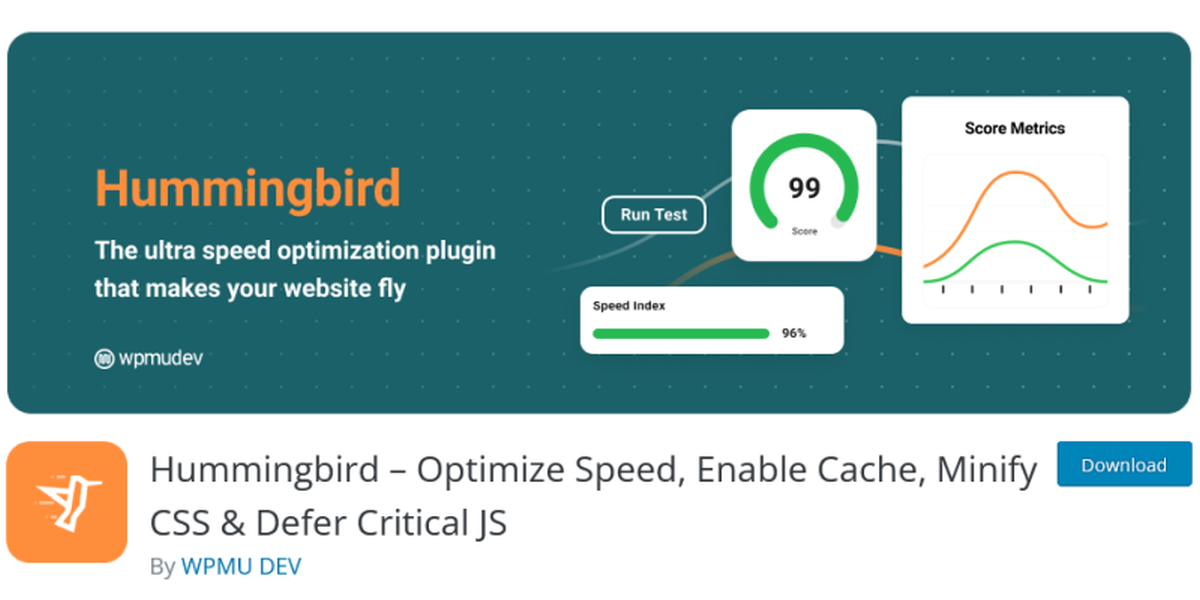
Hummingbird
Hummingbird is a WordPress caching plugin that makes your visitor’s browser store copies of your website’s files locally. In turn, this causes your website to load faster next time they visit. This is especially beneficial for mobile users.
Hummingbird also allows GZIP compression for quicker file delivery, minifies and defers CSS and JavaScript code, removes render-blocking resources, and supports lazy image loading.
In Conclusion
You are now aware of how much responsive design improves mobile traffic, keeps consumers pleased, decreases bounce rates, and enhances conversions, and therefore allows you to easily monetize and increase the profitability of your website. We hope this list helped you in your web design endeavors.
yehiweb
Related posts
New Articles
6 Platforms Similar to Retool for Internal Tool Builders
Building internal tools has become a critical priority for modern organizations aiming to streamline operations, reduce manual work, and empower…


