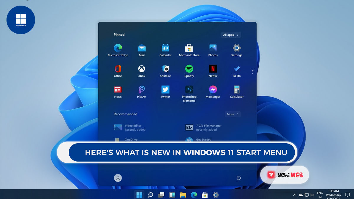
Take a look at the new Windows 11 Start Menu. The new Start Menu may be the most prominent and significant of all the changes coming to Windows 11. This essential component of Microsoft’s experience is now reimagined and enhanced.
We now have a new home on the taskbar and a redesigned layout of apps and functions. The Start Menu serves as your computer’s main control panel.
It is where you will look for apps that are not currently on your desktop or pinned to the taskbar. It also serves as a shortcut to the settings menu and power controls.
Windows 11 Start menu
The Start Menu’s elements may not be as advanced or detailed as you would like. But, it is an excellent place to start and provides a quick access point to the tools you need at any given time.
Microsoft has made significant changes to the Start Menu in Windows 11. With simplified functions and reimagined layout, it provides a cleaner user experience.
There is still a lot we do not know about the new Start Menu. But, by looking at the videos and photos from Microsoft’s Windows 11 presentation. In the Start Menu, we may learn more about what is new, what’s changed, and what stays the same.
Start Button Placement
The placement of the Start Button in Windows 11 differs from earlier versions of Windows. Rather than staying in the same spot in the lower-left corner of the screen. The Start button and menu are now moved to a more central position. The taskbar’s center section runs down the bottom of the screen.
You can move the start button back to its original location if you prefer the old layout. As always, you can access this menu by pressing the Windows key.
The Start Menu’s Anatomy
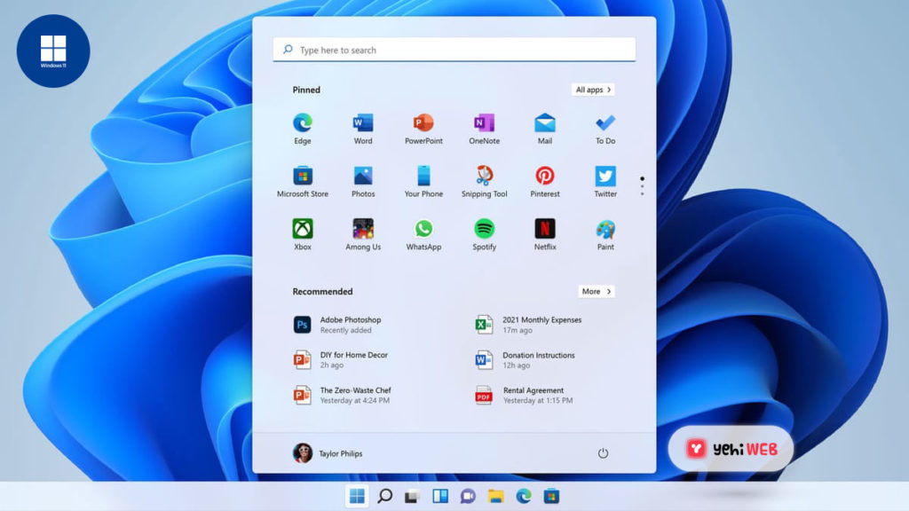
The new Start menu seems cleaner than before, and the move from the corner to the center of the screen could provide some exciting improvements in the efficiency of browsing the apps and files.
But, change brings confusion, and we will not use the final version of Windows 11 until then. The images from the announcement itself might be our best new Start Menu information.
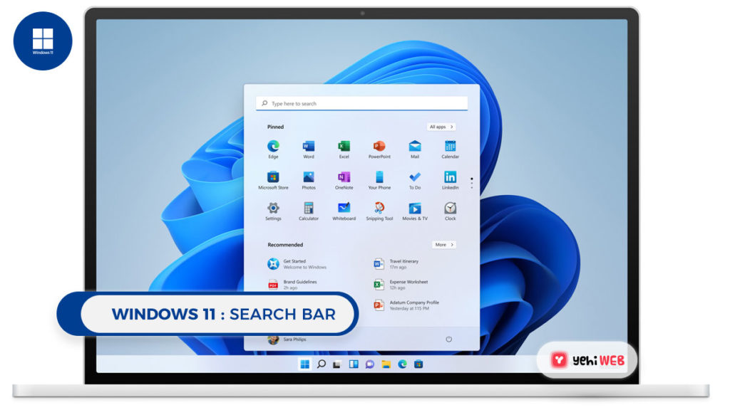
Search Bar
A search bar is located at the very top of the Start Menu. This should be a self-explanatory function. It allows you to type in the text to search across all your computer’s apps and files.
Additionally, you can use it to pull up information from the internet as well. It also shows relevant search results from the Windows store. According to the info presented in Microsoft’s preview film.
It appears like the search results begin to populate as soon as you start typing. Featuring a search results UI that allows you to filter between Apps, Documents, Web results, and other relevant items
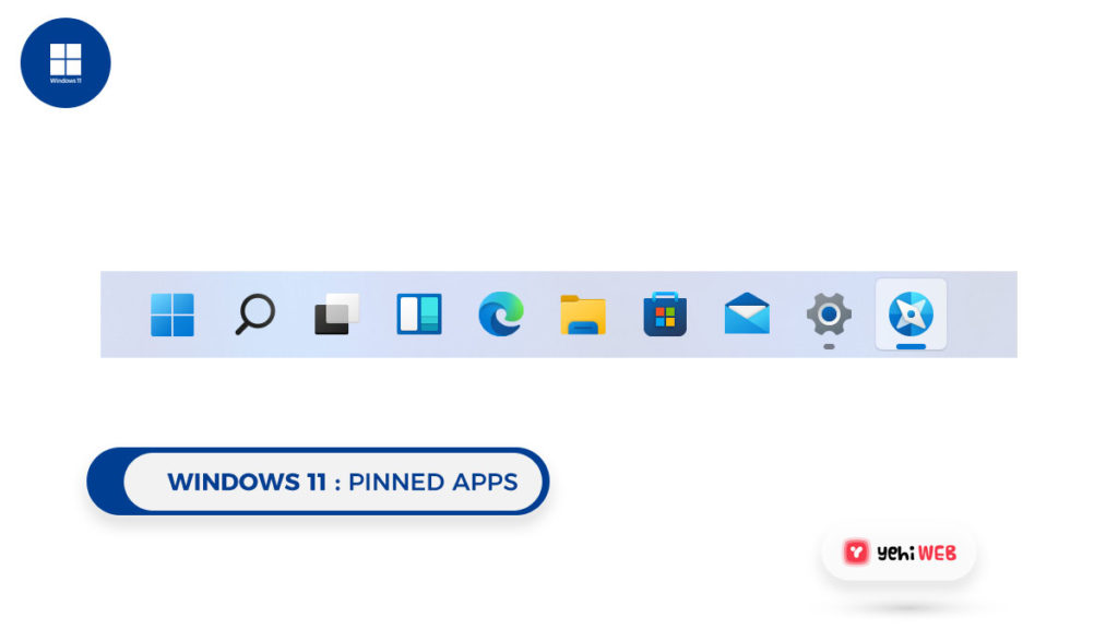
Pinned apps
The next thing is a collection of icons for all your apps. This refers to pinned apps that should indicate that we are looking at a user-curated list of used apps rather than one created by the system.
This update frees up a lot of menu space for the applications you want to use. Allowing you to personalize the start menu to meet your specific needs
A button for All Apps can be seen at the top of this pinned app menu. Previous versions of the start menu include an extensive scrolling list of all the apps and programs installed on the system.
It is interesting to note that the icon panel of the programs contains three dots. The position and design for that unknown element imply that you can switch between them by clicking on several sets of pinned apps.
Recommended
The Start Menu’s next large section is called Recommended. It appears to be a collection of computer-generated recommendations for the apps and files you are most likely to use.
The specifics about the choice of these items were not made public. This may lead to anything being based, from frequently used apps to files that are opened every day at the same time.
User account
A profile image shows the active user account at the bottom of the start menu. Usually, you can choose to switch users or lock your system when you click this.
Power
And a power icon is located on the lower right side of the Start menu. If your computer is anything like Windows 10, selecting this icon will bring you options to shut it down, restart it, or just put it to sleep.
GoodBye Live Tiles
When Microsoft introduced Windows 8 back in 2012, Live Tiles appeared, which replaced static app icons with a dynamic square grid menu that displayed icons, pictures, or real-time input from a given application. For Windows 10, Live Tiles remained on with some tweaks to make them more useful.
However, when icons are reinstated on the Start menu, this real-time functionality appears to have been rebranded as widgets and removed from the Start menu. While Live Tiles were visually appealing, the cluttered interface they produced was not always simple to use.
The automated tile categorization may be perplexing, and the dynamic features of tiles resulted in a visually crowded menu.
Other Feature changes for Start Menu
The Start Menu will also lose the option to create named groups and folders of apps, according to the Windows 11 specifications. Your pinned apps and sites will not transfer over when you update from Windows 10, so be prepared to recreate some of your customizations.
It is also worth noting that the new Start Menu is not resizable, which is a feature that has been available since Windows 8. This may change in the future – I could see menu and icon sizes as significant accessibility features, but it is one size fits all for now.
Saad Shafqat
Related posts
New Articles
What Is Confluence Software? Features, Use Cases, And Collaboration Tools
Modern organizations generate vast amounts of information every day—project plans, meeting notes, product documentation, knowledge base articles, and internal policies….


